68% of Roofing Leads Start on Mobile — What Your Site Looks Like on a Phone
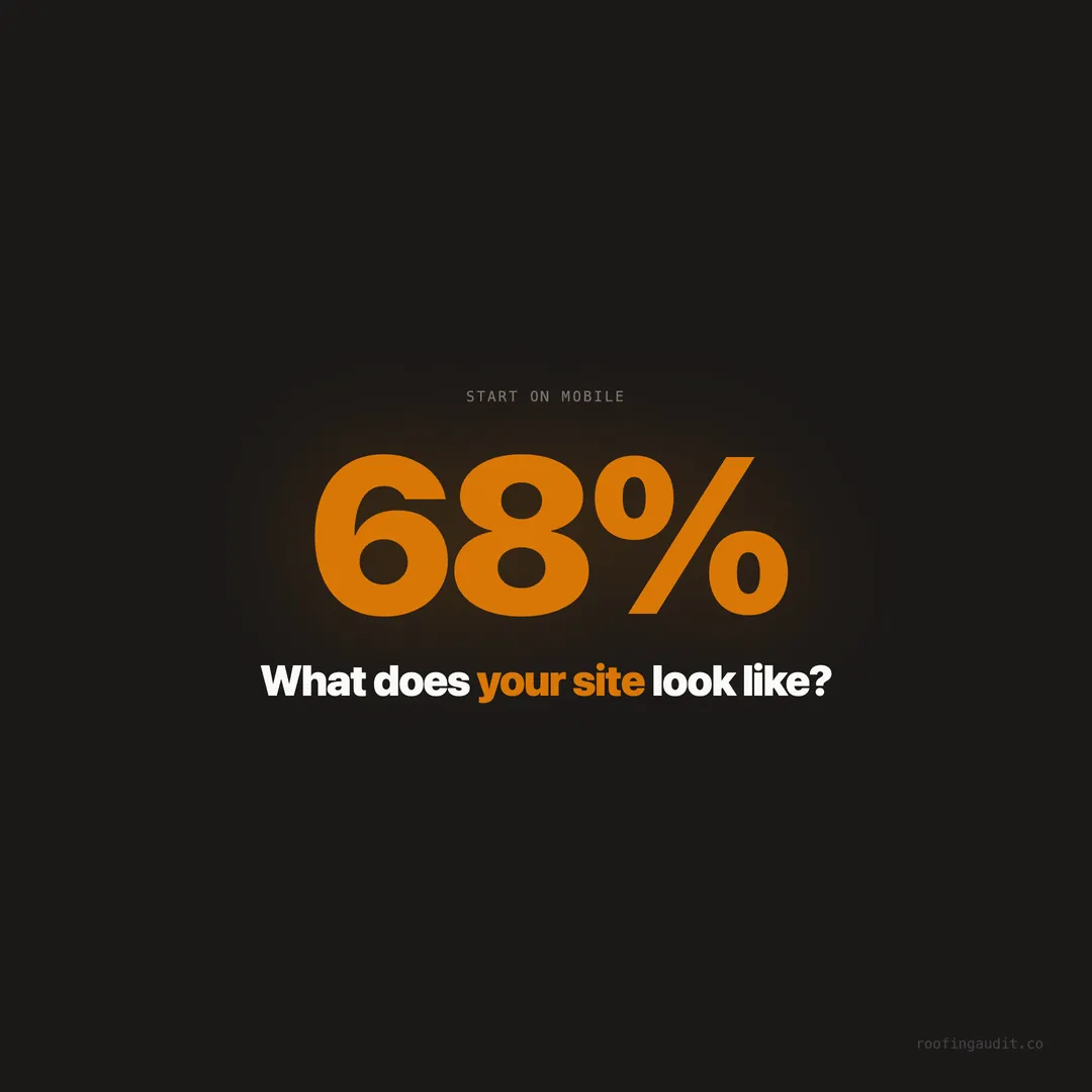
68% of roofing leads begin on a mobile device. We audited 1,409 sites and found broken tap targets, missing click-to-call, and pages that fail on cell networks.
A homeowner in Jacksonville notices water staining on her ceiling after a Thursday afternoon storm. She’s standing in her kitchen, holding her phone, and she types “roof repair near me” into Google. She doesn’t walk to a computer. She doesn’t wait until she’s at a desk. She searches right now, on her phone, because the ceiling is dripping.
68% of roofing leads start exactly like this — on a mobile device. Not a tablet. Not a laptop. A phone, held in one hand, used by someone who needs a roofer and needs one fast.
When we audited 1,409 roofing company websites across Texas, Florida, and Georgia, we tested every single one on mobile. What we found was a disconnect that costs roofers thousands of dollars per month: companies spending $187 per click on Google Ads to drive traffic to websites that barely function on the devices their customers actually use.
The Desktop Illusion
Most roofing company owners check their website on a computer. They sit at their office desk, open the site on a large monitor with a broadband connection, and everything looks fine. The photos are crisp. The navigation works. The forms load properly.
Then they wonder why the phone isn’t ringing.
The problem is that their customers aren’t seeing that version of the site. The homeowner on her phone sees a different experience — one the roofer has often never tested. Text that’s too small to read. Buttons too close together to tap accurately. A phone number that isn’t clickable. A contact form where the fields are so narrow she can barely type her address.
This gap between “how the owner sees the site” and “how the customer sees the site” is one of the most expensive blind spots in roofing marketing.
The Five Mobile Failures That Kill Roofing Leads
Our audit flagged five specific mobile issues that appeared across hundreds of sites. Each one creates friction at the exact moment a homeowner is deciding whether to call or move on.
Tap Targets Too Small or Too Close Together
Mobile screens are small. Fingers are imprecise. When navigation links, buttons, or form fields are crammed together — less than 48 pixels of touch target — the homeowner taps the wrong thing. She hits “About Us” when she meant to hit “Free Estimate.” She accidentally opens a menu when she was trying to scroll. Each mis-tap is a frustration. After two or three, she leaves.
Google’s own Core Web Vitals guidelines specify a minimum 48x48 pixel touch target with at least 8 pixels of spacing between adjacent targets. In our audit, sites that failed this basic threshold had measurably higher bounce rates on mobile.
The fix is simple: make buttons bigger, add spacing between links, and test by tapping the site on an actual phone. If your thumb can’t hit the “Call Now” button reliably, neither can a homeowner’s.
Phone Number Isn’t Clickable
This is the most baffling mobile failure in roofing websites. A homeowner on her phone wants to call a roofer. The phone number is right there on the page. She taps it. Nothing happens. The number is rendered as plain text, not a clickable tel: link.
She now has to memorize or copy-paste the phone number, open her dialer, and type it in manually. On a phone. Where the entire purpose of being on a phone is to make a call with one tap.
When we audited 1,409 sites, a significant percentage had phone numbers that weren’t wrapped in clickable links on mobile. For a business where the phone call is the conversion, this is the equivalent of locking the front door during business hours.
Every phone number on a roofing website — header, footer, contact page, sidebar — needs to be a tel: link. One line of code. One of the 34 elements in our checklist that should never be missing.
No Sticky Header or Floating CTA on Mobile
On desktop, the phone number and “Free Estimate” button sit in the header, always visible. On mobile, the homeowner scrolls past the header in the first second. Now she’s reading about services, looking at project photos, checking reviews — and the phone number is gone. It’s at the top of the page, above the scroll.
She has to scroll all the way back up to call. On a long page — which many roofing sites are — that means swiping past 15-20 screens of content to find the number again.
A sticky mobile header or floating CTA button solves this instantly. The phone number or “Get Free Estimate” button stays fixed at the bottom of the screen, always one tap away, no matter how far down the homeowner scrolls. The best roofing sites in our audit all use some version of this pattern.
Viewport Not Configured
The viewport meta tag tells a mobile browser how to scale the page. Without it, the browser renders the desktop version of the site at full width — which on a phone means everything is tiny. The homeowner has to pinch-to-zoom to read text, navigate menus, and tap buttons. The site technically works, but the experience is hostile.
This is a solved problem from 2012. One meta tag in the HTML head. Yet we still found roofing sites in 2026 that either lack it or have it misconfigured. These sites look fine on desktop. On mobile, they’re nearly unusable.
Slow Load on Cell Networks
A site that loads in 2 seconds on Wi-Fi can take 8-12 seconds on a 4G connection and even longer on congested networks after storms — exactly when roofing searches spike. We covered the cost of slow load times in detail in our post about how a slow website costs roofing jobs. On mobile, the speed problem is amplified because the connection is slower, the processor is weaker, and the homeowner’s patience is shorter.
53% of mobile visitors leave after 3 seconds. That number comes from Google’s own research, and it’s particularly punishing for roofers because the traffic is high-intent. This isn’t someone casually browsing — it’s someone with a damaged roof, ready to call, who got tired of waiting for the page to load.
What a Homeowner Actually Sees on Her Phone
Let’s walk through a typical mobile experience on a roofing website that hasn’t been optimized.
She searches “roof repair near me” on her iPhone. She taps the first result. The page starts loading. A large hero image — uncompressed, 3 MB — dominates the connection. While it loads, the text is invisible. At 4 seconds, the header appears but the hero image is still half-loaded. Text appears at 5 seconds but the layout shifts, pushing the phone number off screen.
She scrolls down. The text is readable but the line length spans the full screen width — 90+ characters per line — making it hard to track across. Buttons are small. She sees a “Contact Us” link and taps it, but she actually tapped the “Services” dropdown next to it. The menu opens. She closes it. She finds the contact page. The form fields are narrow and the “State” dropdown doesn’t work well on her phone’s browser. She gives up and tries the phone number. It’s not clickable.
She hits back. Taps the second Google result. That site loads in 1.5 seconds, has a floating “Call Now” button at the bottom of her screen, and a large clickable phone number. She taps. A roofer answers. She schedules an inspection for Friday.
The first roofer paid $187 for that click. The second roofer got a $12,000 job.
Mobile-First Design Is Not Optional — It’s the Default
Google switched to mobile-first indexing in 2019. That means Google crawls and ranks the mobile version of your site, not the desktop version. If your desktop site has great content but the mobile version hides it, truncates it, or makes it unreadable, Google sees the degraded version.
For local search — which is where roofing companies live — this is critical. “Roof repair near me” results are determined by the mobile version of your site. If the mobile experience is poor, your rankings suffer. Lower rankings mean fewer clicks. Fewer clicks on a site with mobile problems means almost zero leads.
This isn’t a trend that’s coming. It has been the reality for seven years. Yet our audit of 1,409 roofing websites found that a significant number still treat mobile as an afterthought — a shrunk-down version of the desktop site rather than the primary experience.
The Mobile Checklist for Roofing Websites
Here’s what needs to be true on the mobile version of every roofing site. Each of these is part of our 34-element checklist:
Clickable phone number in the header, visible without scrolling. Wrapped in a tel: link so one tap starts the call.
Sticky header or floating CTA that follows the visitor as she scrolls. The phone number or “Free Estimate” button should never be more than one tap away.
Touch targets at least 48x48 pixels with adequate spacing between adjacent elements. Test by tapping every button and link on a real phone.
Fast load time on cellular data — under 3 seconds. Test on an actual phone using cell data, not Wi-Fi. Or use Google PageSpeed Insights, which simulates a throttled mobile connection.
Proper viewport meta tag so the page renders at the correct width and scale for the device.
Readable text without zooming — at least 16px body text, adequate line height, and lines no longer than 70-80 characters.
Forms that work on mobile — fields large enough to tap, dropdowns that render properly, and submit buttons that don’t require scrolling to find.
Images sized for mobile — not a 4000px desktop image sent to a phone. Responsive images serve smaller files to smaller screens, cutting load time and data usage.
How to Test Your Roofing Website on Mobile Right Now
You don’t need a developer for this. You need your phone and 10 minutes.
Step 1: Search for yourself. Open Google on your phone (not Wi-Fi — use cellular data). Search your company name. Tap the result. Time how long the page takes to load.
Step 2: Try to call. Find the phone number on the site. Tap it. Does it start a call? If not, that’s the first thing to fix.
Step 3: Scroll and tap. Scroll through the entire homepage. Tap every button and link. Did you mis-tap anything? Were any targets too small? Did the layout shift while loading?
Step 4: Submit a test form. Go to the contact page. Fill out the form using your phone. Is it easy? Or did you fight with the fields?
Step 5: Check your gallery. Open the project gallery. Do the images load quickly? Can you swipe through them? Or does the page grind to a halt?
Document everything that frustrated you. Those frustrations are what 68% of your potential customers experience every time they visit your site.
The Revenue Impact of Getting Mobile Right
When a roofing website nails the mobile experience, the effect on lead generation is immediate and measurable. We’ve seen it in the data across 121 cities in our audit.
Sites that load under 2 seconds on mobile, have a clickable phone number, and show a sticky CTA consistently outperform sites that don’t — not by a small margin, but by multiples. The same Google Ads spend. The same market. The same services. The difference is whether the phone rings.
At $187 per click and jobs worth $8,000 to $25,000, a mobile-optimized site doesn’t just perform better. It transforms the economics of every marketing dollar the company spends.
Your next customer is standing in her driveway right now, looking at her phone. What she sees in the next 3 seconds determines whether she calls you — or the roofer who loaded faster, looked better on mobile, and made the phone number impossible to miss.
If your site isn’t built for her phone first, you’re not just missing leads — you’re funding your competitor’s lead pipeline with your own ad spend.
Keep reading
Want to know your score?
Drop your URL — full report in 48 hours.
We're on it.
Report in your inbox within 48 hours.